Focusing on intelligent technology, particularly the type which aids people’s health and wellbeing, Crystal responds to an increased interest in the impact of colour in design and its links to mental wellbeing. Adopting elements of colour psychology theory in interiors helps to lift people’s moods and aid health.
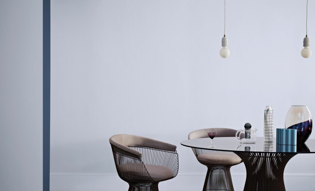
Using iridescent and semi-transparent materials in a myriad of pure, crystal-like tones creates hypnotising overlays of multiple colours, as portrayed in the Crystal trend. Inspired by the effects of lights of changing colours and augmented reality, the result is a dreamy space of escape using crustal hues of aqua and violet.
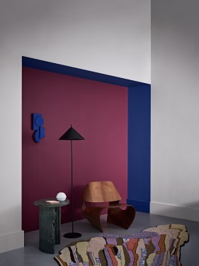
“Pure, clean, sleek and highly polished, Crystal captures the layered look of coloured translucent materials created by using tone on tone colour. It was important to capture iridescent elements through the props and for the styling to be crisp and extremely modern with sleek, highly polished translucent glassware. The idea of cleanliness, calm and tranquillity is expressed through the colours within this palette. Hues are tonal: cool blues with an intense cobalt and aqua to highlight.”

KATHRYN LLOYD
Crown Design Studio
The Look
Creating an ethereal world and an escape from reality.
